NEW ORLEANS BURGER RESTAURANT


During the process of understanding the client, we deduced the direction towards a modern version of the classic american style diner.
The original style diner is narrow and elongated. In the traditional diner floorplan, a service counter dominates the interior, with a preparation area against the back wall and floor-mounted stools for the customers in front. There is a row of booths against the wall opposite to the counter.
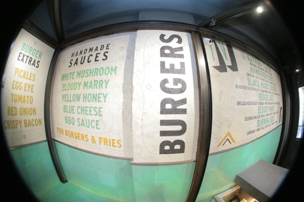
The space layout, determined by the elongated geometry of the premises, suggested itself, a similar approach. Therefore, just a few feet passed the entry hall, the sidebar was treated as a large desk/counter where the menu is ‘’printed’’ on a concrete wall. The technique is called wall tattoo and it reminds us of the street art stencils, giving a feel of public space. The logo and catchphrases are also depicted on the walls with the same technique covering most of the surface of the restaurant.
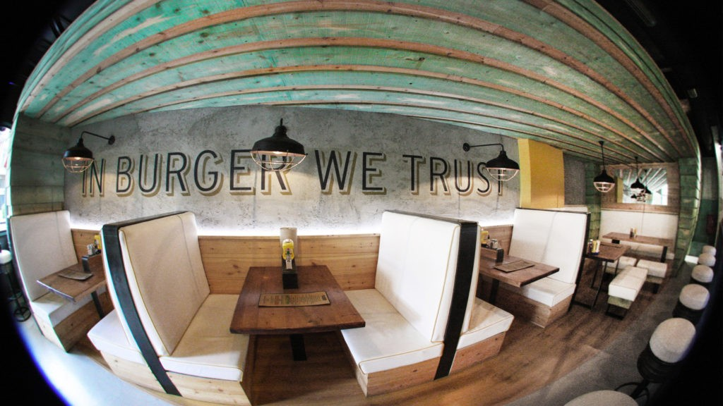
Meanwhile in the rear dining area, the guests are to be accommodated according to the classic seating arrangement of a train: On double opposite seats facing each other across from a table. The dining area is covered by an independent wooden installation that reminds us of a train wagon and suggests a friendly and welcoming environment. Metal beams that emerge above the wooden “wagon“, bear the ceiling lights and emphasize the independence of the installation.
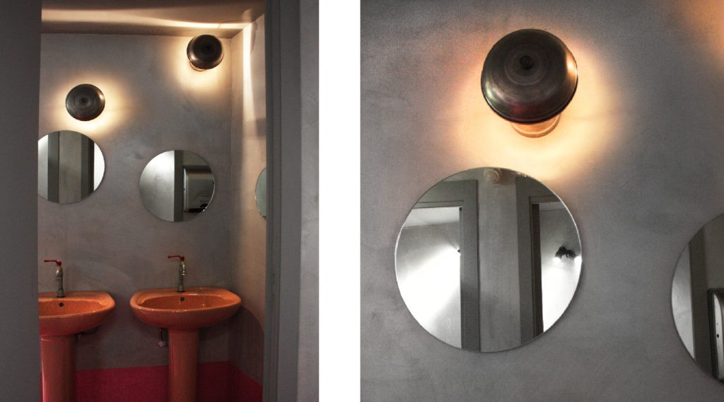
The alternation of texture: tile and concrete, metal, wood and white leather and the vintage green and yellow ‘diner’ colours, stand out against the clean sobriety of a deep gray background. This neutral envelope of darkened ceilings and walls, is dotted with industrial-looking lamps.


